Canadian Coat-of-Arms and Shields
|
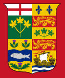
Canadian Shield 1868-1921 (Official)
In May of 1868 a royal warrant granted arms to the four provinces and and from those the Great Seal of Canada was created, which had the four provincial arms quarterly. In the 1st quarter (top-left) was the arms of the Province of Ontario, in the 2nd quarter (top-right) was the arms of Quebec, in the 3rd quarter (bottom-left) was the arms of Nova Scotia, and in the 4th quarter (bottom-right) was the arms of New Brunswick.
Though the Great Seal looked like a coat-of-arms, it technically was not. The Nova Scotia arms did not look like the current ones. They were gold with a wavy blue horizontal bar charged with a silver salmon, with two thistles above and one below.
It is also interesting to note that the present arms of Nova Scotia were actually granted by King James I sometime between 1621 and 1625 (the actual Grant of Arms was either lost or destroyed prior to 1672). Since this history was not known in 1868, a new coat of arms was designed and granted. Evidence for King James grant of arms was discovered in the 1920s, and accordingly, the 1868 arms were cancelled and the original arms restored in 1929.
|
|
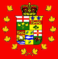
Canadian Shield 1870-1873
In 1870 the Canadian shield underwent a change dividing the bottom row of province arms into thirds, i.e. from left to right, New Brunswick, Nova Scotia, and adding the arms of Manitoba. This first design of Manitoba's seal is similar to the present arms, but without the rock, with a crown on the cross, and with the buffalo portrayed charging. This gave rise to the assumption that quarterings for other provinces would be added when they were admitted to Confederation, but the Manitoba symbol (and those of the later provinces) were never officially added to the Great Seal.
However, this made little difference, since most flag makers usually added the symbol to both the Blue and Red Ensigns. Until 1922, there were many variations in displaying the shield on the flag: sometimes a white disk was behind the shield, sometimes there was wreath of maple leaves or a wreath of roses, thistles, and shamrocks, and sometimes the shield was topped by a beaver or crown.
|
|
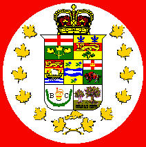
Canadian Shield 1873-1892
This version of the Canadian shield added a new third row of provinical seals, the first being for British Columbia and the second being for Prince Edward Island.
The Confederation of British Columbia initially used the royal crest (a crowned lion standing on a crown) with the motto "splendor sine occasu," sometimes flanked by laurel or oak leaves, and sometimes with the letters "B" and "C."
The Confederation of Prince Edward Island continued to use the design it had used since 1769. It is very similar to the present coat of arms, except that the motto "parva sub ingenti" was an integral part of the design and the chief with lion was missing.
|
|
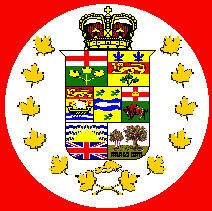
Canadian Shield 1896-1901
In 1896, British Columbia adopted Canon Beanland's new seal showing a sunset over the Union Jack. His 1896 British Columbia arms were designed in conjunction with the construction of the new provincial parliament buildings. Today, tourist guides still tell the story about the design being rejected by the College of Heralds because "the sun set over the British Empire," but that is nonsense. The correspondences between the provinces, Sir Joseph Pope and the College of Heralds tell a different story.
The Heralds objected to the use of the Union Jack completely, they suggested that British Colummbia use a Cross of Saint George, as in the arms of Ontario, Manitoba and Alberta, or a lion as in the arms of Nova Scotia, New Brunswick and Québec should be used to symbolize the British connection, but the British Columbia provincial government would not bend, hence eventually the addition of the antique crown in 1906 so that the pattern would no longer be a Union Jack.
|
|
Canadian Shield 1901
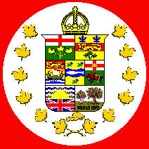
As these aberrant ensigns bore a crown, they underwent a change in 1901. During the Victorian era, the Saint Edward's crown (with the depressed arches) had been used, but upon the accession of Edward VII, in 1901, the (Tudor) crown with raised arches was adopted.
In my experience, all the UnOfficial Canadian Red Ensigns with the badge on a white disc which I have ever seen bore a wreath of green maple leaves, not gold maple leaves. This is not to say that flags with gold leaves didn’t exist, but they certainly were not common.
By-the-way, the small golden object just below the shield is a beaver.
|
|
Canadian Shield 1907-1924
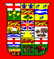
The 19th Century provincial badges of Manitoba, Prince Edward Island and British Columbia were not recognized by the College of Heralds, and had to be altered when official provincial coats of arms were authorized in 1905.
The "Union Jack" was moved to the chief because the principal symbolism of the arms should occupy the bulk of the shield (e.g. the sun and water of the British Columbia arms is equivalent to the buffalo of the Manitoba arms).
|
|
Canadian Shield 1907-1924 (type 2)
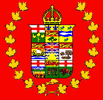
The version of shield has nine provincial crests under a crown and then surrounded by maple leaves (10 on each side) and a beaver at their junction at the bottom.
The nine crests are: Row 1: Ontario, Quebec, and Nova Scotia (one with a fish and three thistles); Row 2: New Brunswick, British Columbia, Prince Edward Island; Row 3: Alberta, Saskatchewan, Manitoba.
|
|
Canadian Shield 1921-1957 (Official)
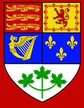
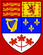
On November 21, 1921, a royal proclamation made the royal arms of Canada to their present form. Flag makers started to use the new "Official " arms right away.
At the end of the Great War when the College of Heralds was working on the current Canadian Coat of Arms, they wanted the maple leaves to be red, as they are at present. Sir Joseph Pope did everything in his power to stop it in favour of green leaves, on the assumption that vigorous leaves are green and dying (fall) leaves are red. The College of Heralds got their way by recommending to King George V that the leaves be "proper," natural coloured in heraldic language. Since both red and green are "proper" hence the change in 1957 could be made without any need to revisit the Grant of Arms.
|
|
Canadian Shield 1957-1965 (Official)
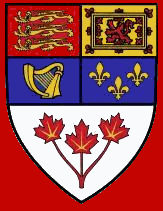
The maple leaves at the base of the Canadian royal arms change from green to red. The 1921 proclamation specified that the leaves be a "proper," natural color, but this was ambiguous because maple leaves can be green, yellow, or red. Artists had previously drawn them green, but on this date the Secretary of State announced that they should henceforth be red.
|
|
Canadian Shield since 1965 (Official)
The shield is divided into five sections. The first division at the viewer's top left contains the three golden lions that have been a symbol of England since at least the reign of King Richard I. The second quarter bears the red lion rampant of Scotland in a double tressure border with fleurs-de-lis, used as a symbol of Scotland since at least the reign of William I. The third quarter shows the Irish harp of Tara. The gold fleurs-de-lis of royal France, the first post-medieval European emblem raised in Canada by Jacques Cartier, during his landing at Gaspé, fill the fourth quarter. The fifth charge, a sprig of red maple leaves at the bottom is a distinctly Canadian symbol that became gradually identified with the country throughout the 19th century.
|
- My thanks to Michael Halleran for all his expert help, research, and advice on this page -
| Top of Page | Return to Canadian Flags Page | Return to "Vexillological Essays and Chart Pages Menu" |
|